Top Finish Curves
By Fraser Walker in Sports Betting
July 28, 2023
Introduction
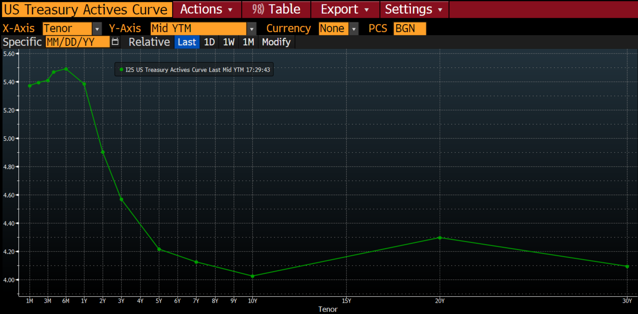
I was getting into the Top Finish betting markets for pro golf tournaments right around when the U.S. Federal Reserve was raising interest rates, and the sentiment that an Inverted Yield Curve leading to a recession was a daily talking point (like here or here), it got me thinking about plotting the Top Finish odds for a player the same way we plot the Yield Curve for generic US Treasuries. This was mostly a curiosity; I had no thesis for how this might help me with my betting if at all – but I went and did it anyway
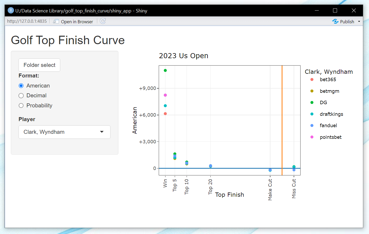
The app is built in RShiny and embeds a plotly graph that has nice tooltip highlighting. See below a the Top Finsh Curve for Wyndham Clark at the 2023 U.S. Open (can’t quite remember when these odds were recorded pre-tournament),
You can see how sharply the payout would drop off from wagering him to win vs. finishing Top 5 (understandably). I was curious to see what the ‘curve’ would look like for different players. Would a premier player (Scottie Scheffler) have a curve that was less steep than a mid-range player (Corey Conners) or a real longshot (one of the amateurs in the field)? What would the dispersion look like among different players and among different finish positions?
You can also change how the odds are visualized for you. The Implied Probability format for example might be more easily comparable since that one will be fixed to the same scale (between 0 and 100%). Let’s compare Rory and Wyndham Clark,

The nice part that Plotly adds for us is the tooltip highlighting. I can click that double-arrow looking button in the header of the plotting space and it will highlight all the sportsbooks I have recorded and show them to me at the same time,
Not that insightful on the face of it, but interesting all the same.


